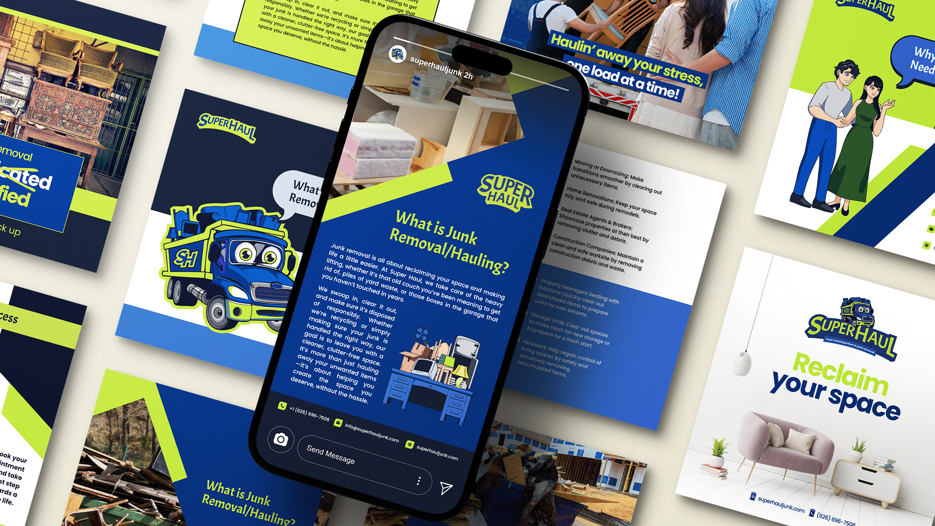
We built the brand from scratch from naming all the way to taking it to market and more. Super Haul was originally Junk 'Em All and to position the brand with more of a Super Hero archetype, and a bit of jester and sage we revamped the client's brand to sound less like a commodity and more like a brand. That process started with brand strategy, then brand identity design, and then marketing infrastructure. After the foundation was built with the custom WordPress web design and development coordination, social media profile creation (LinkedIn Professional and Company, Instagram, Twitter, Facebook Company), we also created Super Haul listings on Yelp, Angi's List, and Google Maps.
Services also included: Photoshop and Canva social media template designs, Yelp ad creatives & ad management, voicemail recording, sticker design, trifold brochure design and printing, branded quick dry t-shirts for the team, truck wrap design, sales deck, business card design & printing, social media management (primarily Instagram and Facebook), 71 page Brand Book development, traveling with the team on junk removal jobs to capture video and photos, and SEO.
Services also included: Photoshop and Canva social media template designs, Yelp ad creatives & ad management, voicemail recording, sticker design, trifold brochure design and printing, branded quick dry t-shirts for the team, truck wrap design, sales deck, business card design & printing, social media management (primarily Instagram and Facebook), 71 page Brand Book development, traveling with the team on junk removal jobs to capture video and photos, and SEO.

Canva and Photoshop templates
Sticker design so people can stick it on their trashcans or someplace they won't forget when their residential trash bins don't cut it.
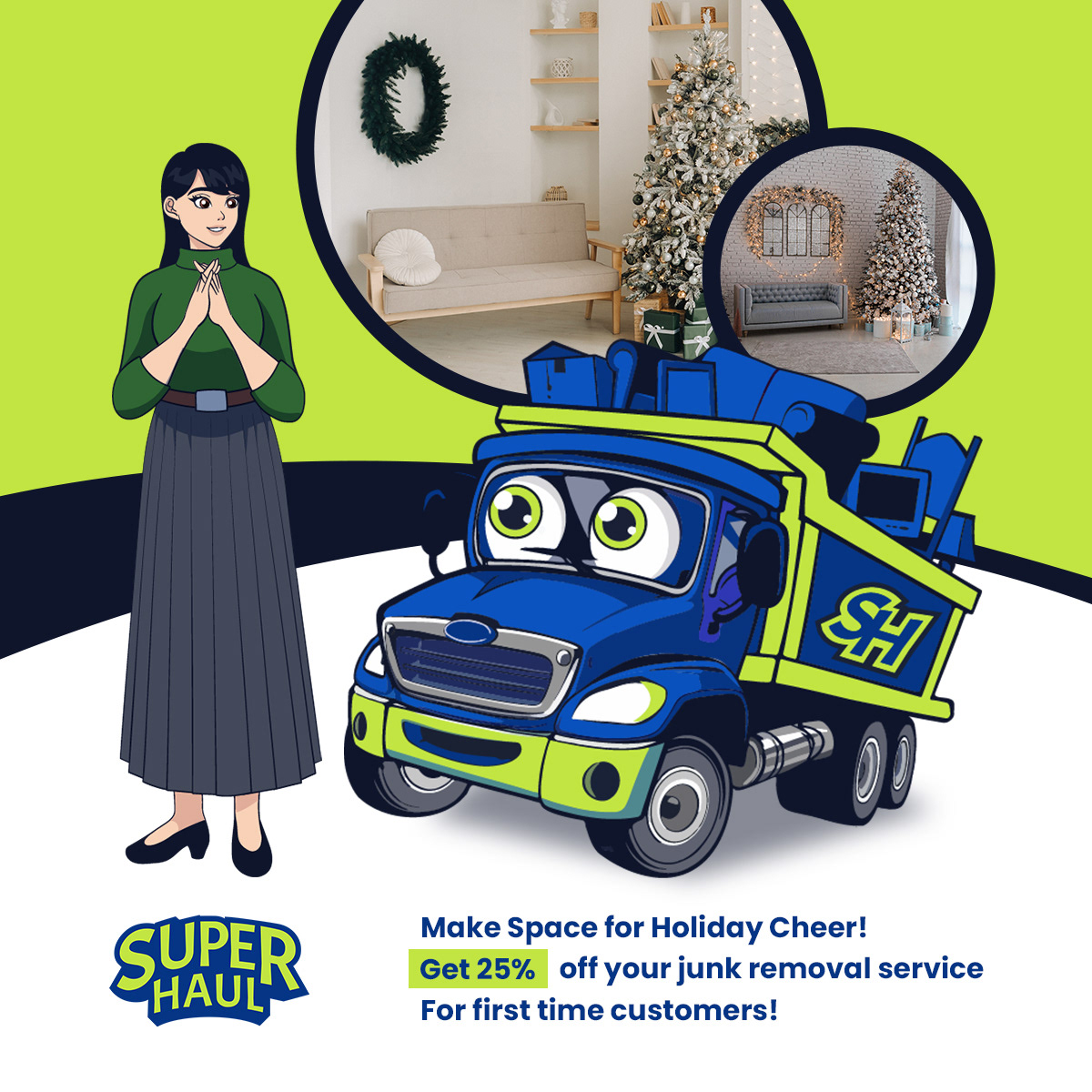
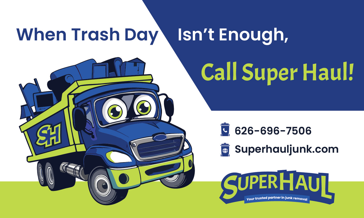
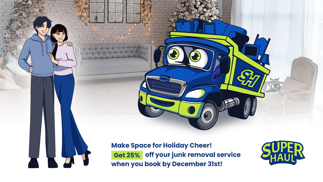
This is a promo graphic designed for Yelp Ad and social media posts.
This is a promo graphic we designed for Google Maps.
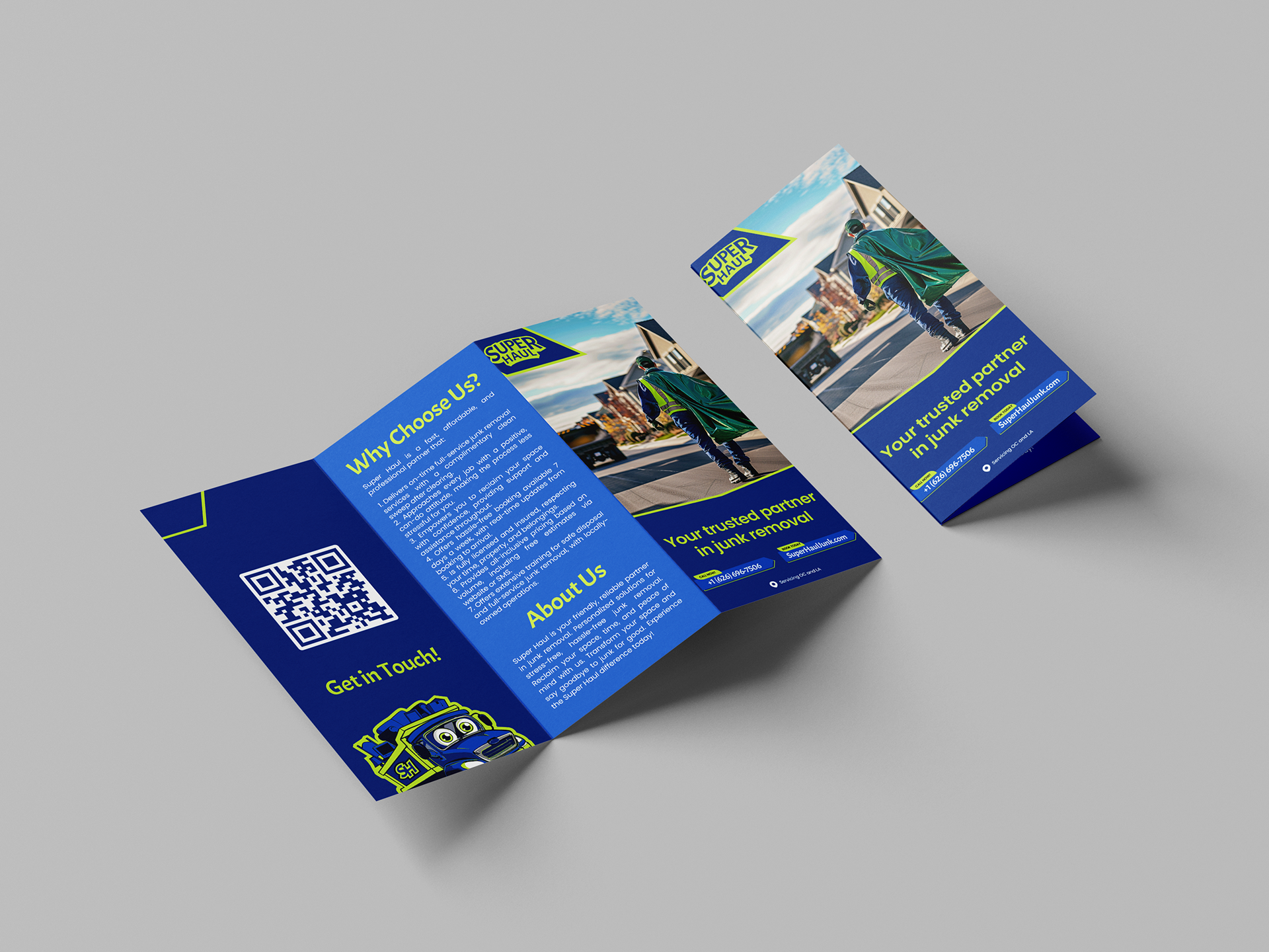
Trifold brochures were designed and printed to pass out to businesses like real estate agents, brokers, construction companies, and more.
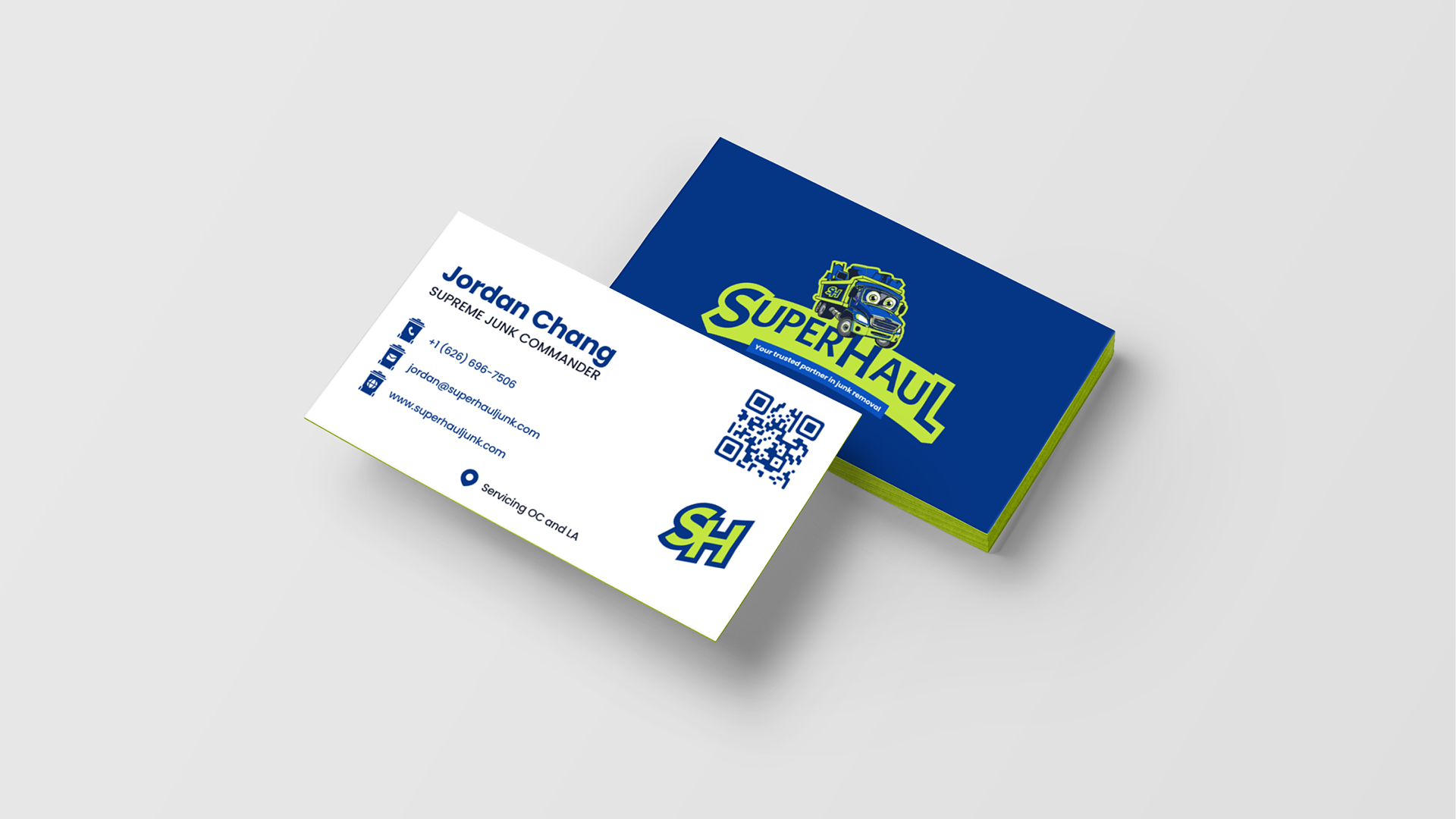
We designed and printed business cards with a green trifecta in the middle and soft touch business cards that feel good in your hands. The QR Code goes to the client's website since we live in the times of convenience. We created a brand that helps remove the stress from those who need junk removed. The custom trashcan icons were designed to play on the "take out the trash" theme. We also named each team member to enhance the brand experience, so instead of CEO, we used Supreme Junk Commander. It's not just about how the brand looks, it's an experience we created.
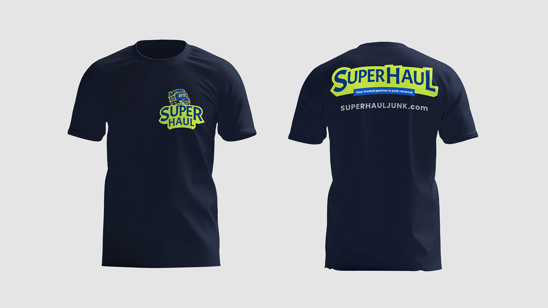
We worked with a third party distributor to source a black quick dry comfortable t-shirt for happy haulers to wear on the job. The classic fit gave the happy haulers a professional look, not too tight, and not too baggy. The website URL was placed on the back of the shirt to make it easy for people to remember since client didn't have a phone number like 1-800-GOT-JUNK.
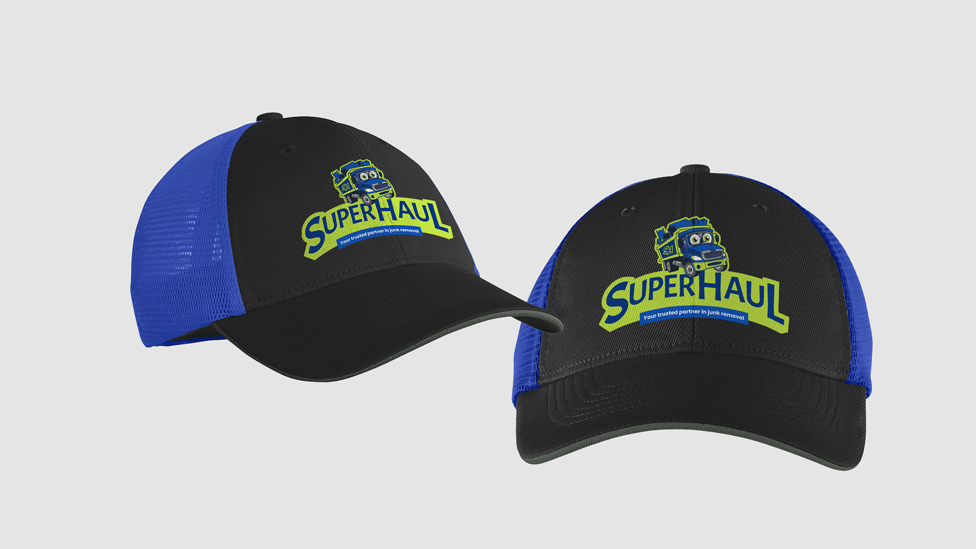
We opted for this design for branded caps based on Nike's white label caps. It helps Super Haul stand out more than having an all black or one solid color cap like most junk removal companies have. It's eye catching enough to grab attention.

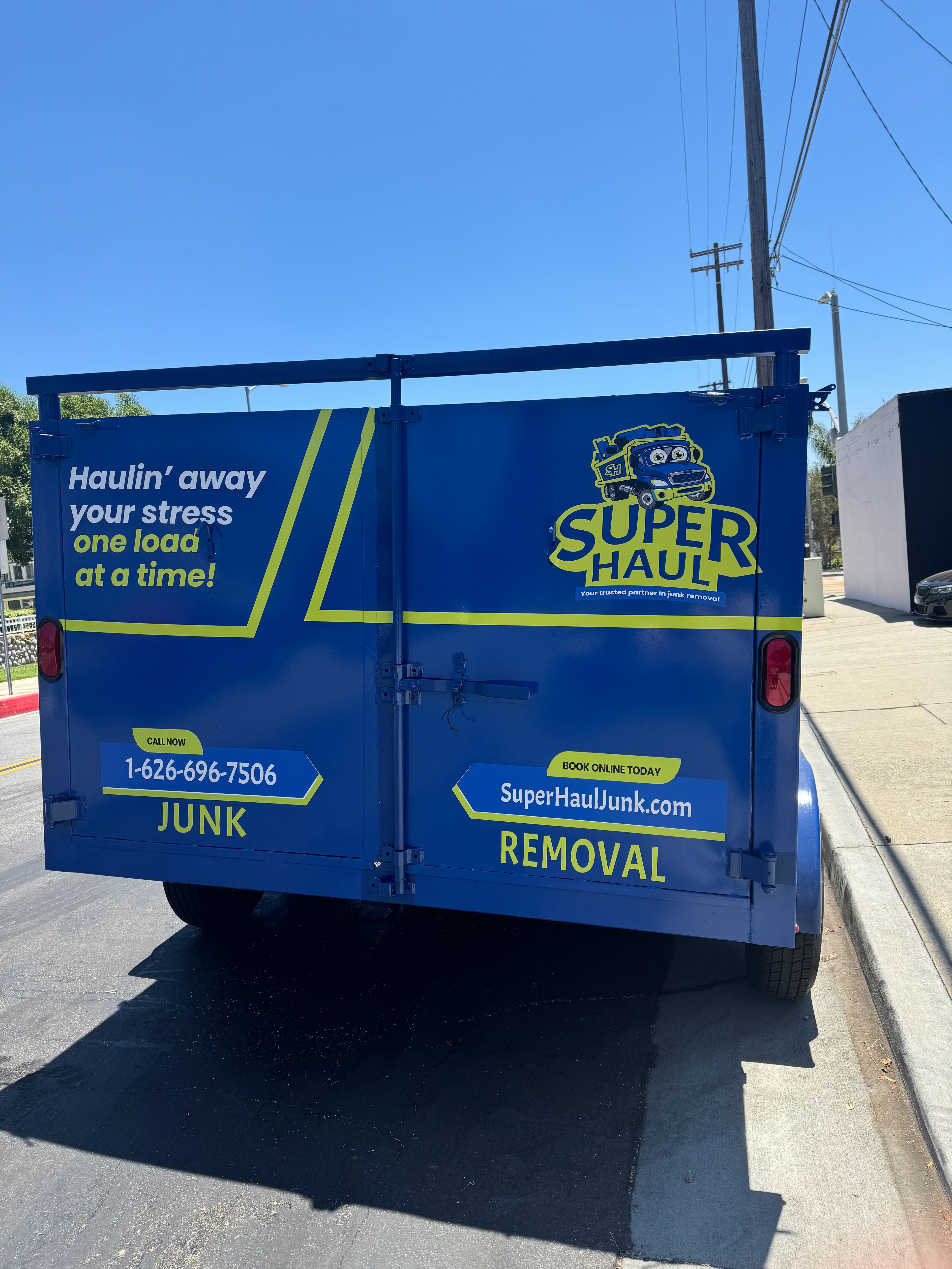
Truck wrap design and we helped client find a vehicle wrap company to execute.
Truck wrap design and we helped client find a vehicle wrap company to execute.
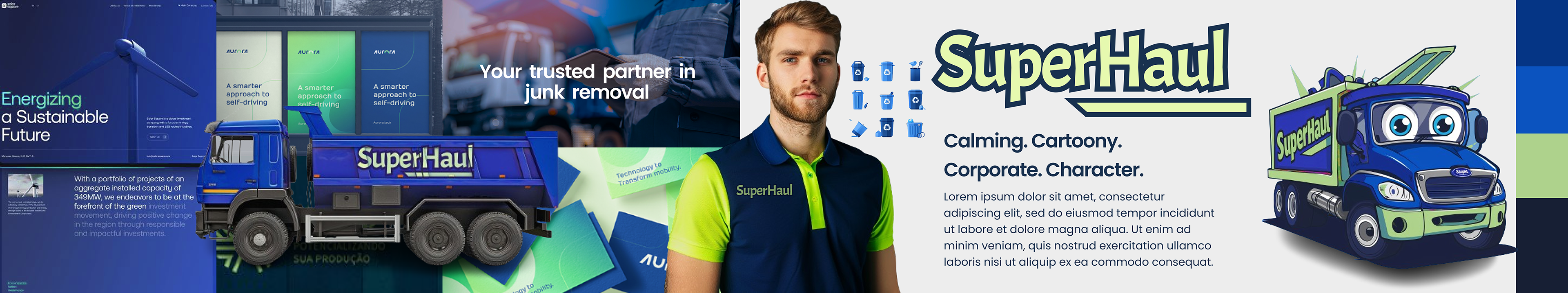
Stylescape (enhanced mood board) chosen amongst four other brand identity design directions. This was the initial concept before the brand was built out with it's individual pieces like the logo, and the calming green color was switched out to Grinch Green since target audience who took the poll mentioned that bright neon green on the model's shirt pulled them in. The brand is primarily targeting women with men as the secondary audience in the Los Angeles and Orange County area.